ELLAElla is Greek restaurant serving a modern twist on the Mediterranean cuisine. The chef sources his ingredients straight from Greece to ensure the quality and authenticity of the dishes, and the restaurant itself boasts a lively, vibrant atmosphere filled with music, joy and celebration.
The brief was simple: create a branding identity for this concept.

I drew inspiration for the logo design through researching the origin of the name Ella.
With origins rooted in Hebrew and Germanic, I found that in Greece, Ella is believed to be derived from Helle, an ancient Greek princess, daughter of King Athamas and cloud-nymph Nephele.
Helle and her brother were sacrificed to the gods by their jealous stepmother, Ino, but were saved by Nephele, who sent a golden-fleeced ram to their rescue. Unfortunately, Helle fell off the ram into stormy waters, and it’s believed she either drowned or was turned into a sea goddess by Poseidon. Hence the Sea of Helle, or Hellespont.
Through this story, I was inspired to create a logo that mimics the fluidity and movement of water.
LOGO


Use of a serif font as a base to maintain a classic, high-end look
Connecting the letters to reflect the fluidity of water, with the letters moving downwards to reflect the flow and natural movement of water.
Addition of organic shapes at the tail ends of the first and last letters to emphasise natural flow and fluidity.
colour palette


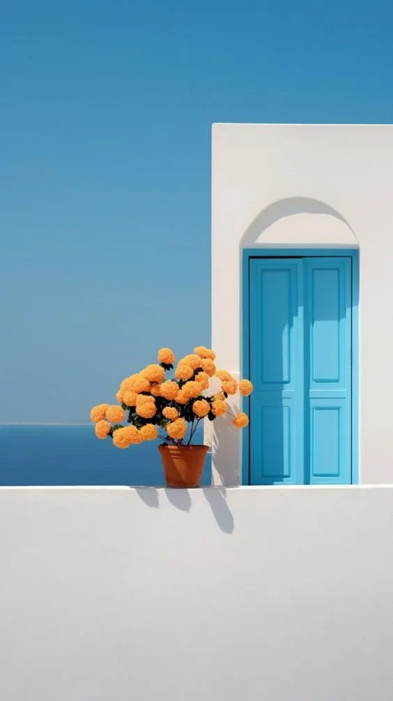
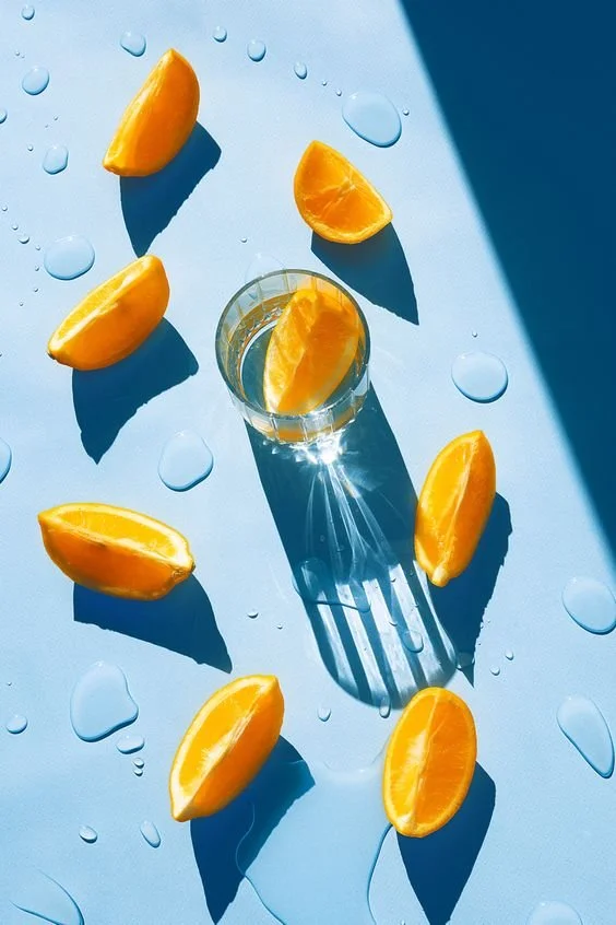
With several Greek restaurants known for their simple, beige and blue-toned colour palettes, I wanted to take it a step further and draw inspiration from the vibrant and playful colours of summer. Fruits, beaches, sunsets were my main inspiration, and I created a palette that included 6 colours to mix and match.


TypographyPlayfair Display

MuseoSans
The font chosen for Ella was Playfair Display, as its font family includes various weights from Regular to ExtraBold as well as italics, giving us more room for flexibility and playfulness. It’s also the base font used to create Ella’s logo, so it plays well with consistency.
For body copy and alternate sub-headlines, I chose MuseoSans, a sans serif font to contrast the heavy use of serifs throughout the brand and keep things simple when need be.
adding a little love


No brand usually feels fully complete without a little pattern to bring it some personality.
It was mentioned that the chef would source his ingredients straight from Greece, so I decided to search what fruits Greece is most known for.
While it’s known for a variety of different fruits, most notably olives, I decided to find organic, hand-drawn patterns of figs, lemons and apricots—three of Greece’s most notable fruits.
BRAND COLLATERALS
Business Cards


Coasters & Placemat


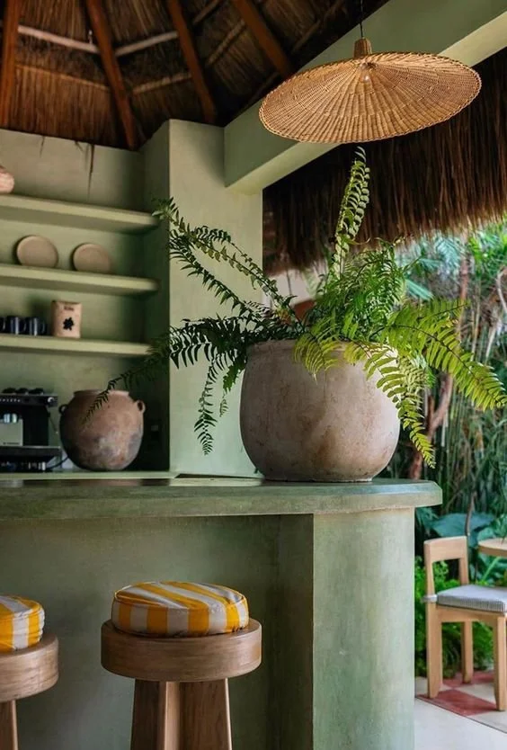
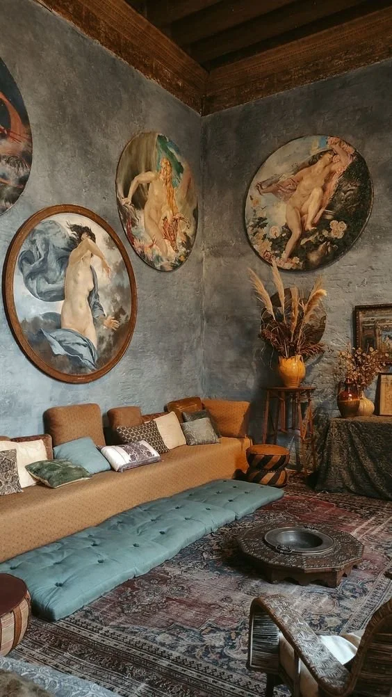
interior look & feelElla’s interior will stand out from its competitors in Dubai. Rather than mimicking the beige and blue tones of Greece’s most prominent islands, it will include beautiful tiles, patterns, and colours from all around the country.
Greece is more than just its vacation islands, it’s a country full of colour and life, and Ella’s interior will reflect that through the art, the patterns and even the accents of its furniture. The restaurant will maintain a boho-chic look with a twist, with inspiration including plants, patterned-tile work, pastel and bold colors, and large murals.


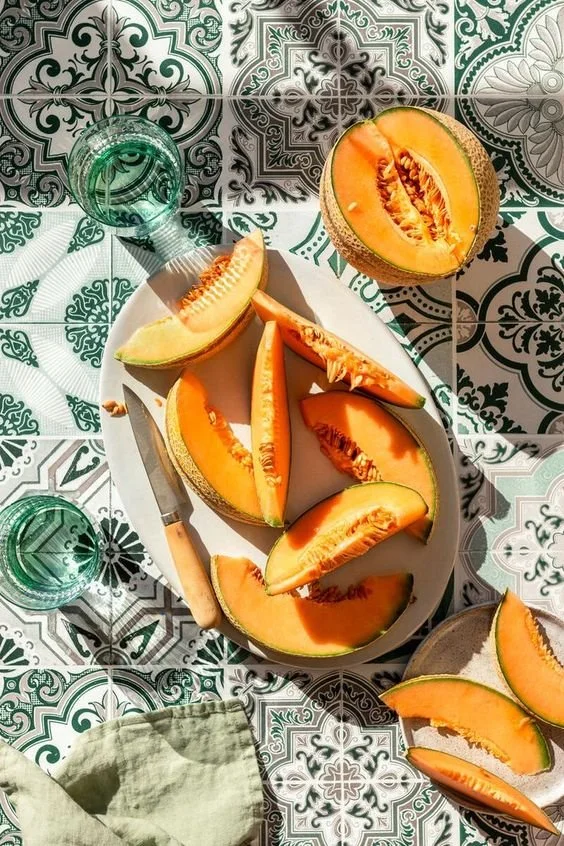


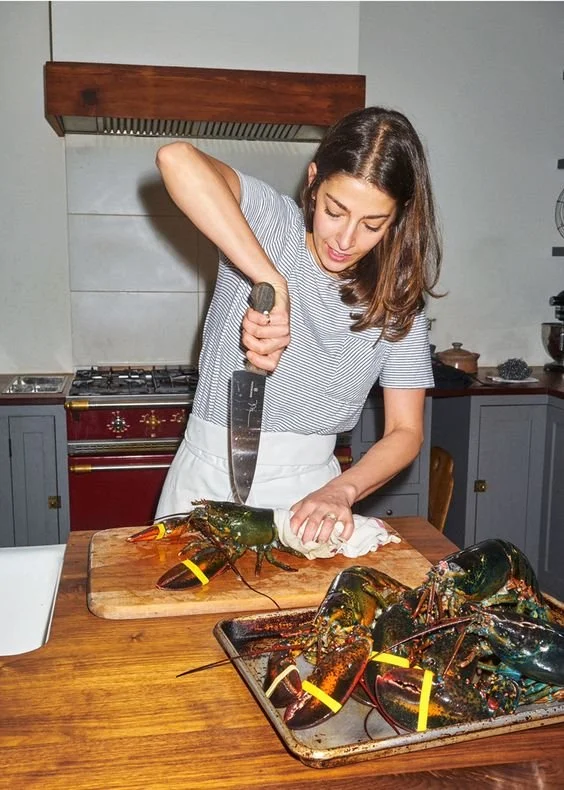
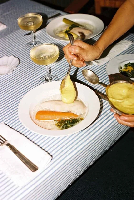
photography styleInspired by high-fashion photoshoots and the Mediterranean nightlife, the photography style would be flashy, colorful and depicting moments of joy and happiness around the restaurant.
Many Greek restaurants use similar clean, clear and bright photography styles to mimic the mood of a Greek island. Ella stands out with maintaining a high-end look while highlighting moments of joy among its visitors through flash photography to set its own standard on what Greek life actually looks like.

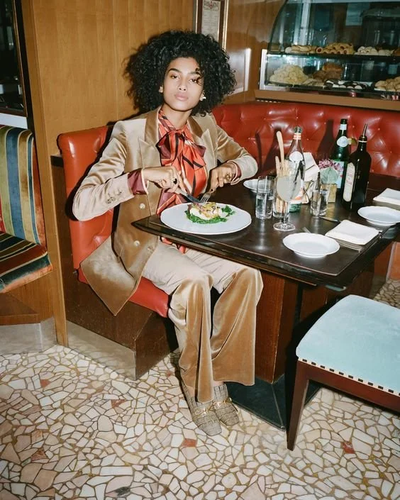
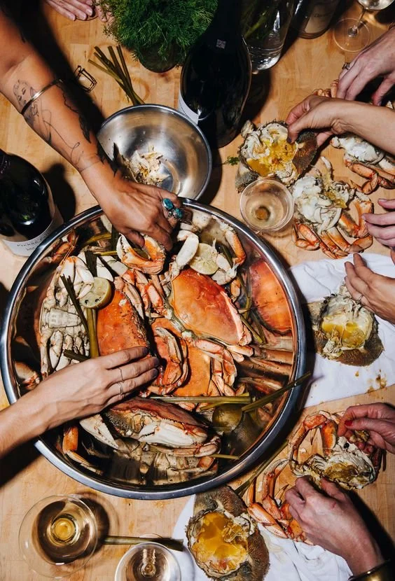


ella's instagramElla’s Instagram grid would be consistent with the chosen photography style, including flash photography of the food, drinks, interiors, even staff and guests (with their consent).
Some imagery includes bold, colourful type to give context to certain posts, or simply to emphasise the ‘loud’ and vibrant atmosphere at Ella. Those chosen posts range from moments from events or weekend nights to highlight the enjoyment people have at the restaurant.

the little detailsLast, but certainly not least, our highlight icons. These icons would have the same style as the brand illustrations, with a vintage but hand-drawn aesthetic, matching the old with the new to create a twist on a modern look.
The icons and their background can be interchangeable between the different colors available in Ella’s colour palette.

